Bootstrap is a popular front-end framework for web development. Designed to enable responsive development of mobile-first websites, Bootstrap provides a collection of syntax for template designs.
Why use Bootstrap?
Easy to use: Anybody with just basic knowledge of HTML and CSS can start using Bootstrap.Responsive features: Bootstrap’s responsive CSS adjusts to phones, tablets, and desktopsMobile-first approach: In Bootstrap 3, mobile-first styles are part of the core frameworkBrowser compatibility: Bootstrap is compatible with all modern browsers (Chrome, Firefox, Internet Explorer, Edge, Safari, and Opera).
Bootstrap CDN
If you don’t want to download and host Bootstrap yourself, you can include it from a CDN (Content Delivery Network).MaxCDN provides CDN support for Bootstrap’s CSS and JavaScript. You must also include jQuery.
Create First Web Page With Bootstrap code.
<!DOCTYPE html>
<html lang="en">
<head>
  <title>Bootstrap Example</title>
  <meta charset="utf-8">
  <meta name="viewport" content="width=device-width, initial-scale=1">
  <link rel="stylesheet" href="https://maxcdn.bootstrapcdn.com/bootstrap/3.4.1/css/bootstrap.min.css">
  <script src="https://ajax.googleapis.com/ajax/libs/jquery/3.7.1/jquery.min.js"></script>
  <script src="https://maxcdn.bootstrapcdn.com/bootstrap/3.4.1/js/bootstrap.min.js"></script>
</head>
<body>
<div class="container">
  <h1>My Bootstrap Page</h1>
  <p>This part is inside a .container class.</p>
  <p>The .container class provides a responsive fixed width container.</p>
</div>
<div class="container">
<h1>Full course</h1>
<p> jhchv bhvcbb hbbcbn bmbhhfrhhbnnjndnmmmnxncm dnsnncmbbrfccm mnbxbjehbjcbbhhvvchsccs</p>
<p>fhcbijohmcbbhfgertndbxserutjjncjjf</p>
</div>
</body>
</html>
OUTPUT

Bootstrap Grid System
Bootstrap’s grid system allows up to 12 columns across the page.
If you do not want to use all 12 columns individually, you can group the columns together to create wider columns:
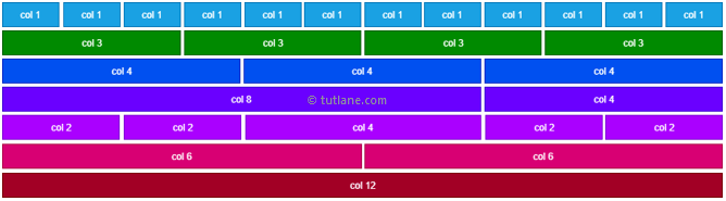
Bootstrap’s grid system is responsive, and the columns will re-arrange automatically depending on the screen size.
Grid Classes
- The Bootstrap grid system four classes:
- . xs (for phones – screens less than 768px wide)
- . sm (for tablets – screens equal to or greater than 768px wide)
- . md (for small laptops – screens equal to or greater than 992px wide)
- . lg (for laptops and desktops – screens equal to or greater than 1200px wide)
Basic Structure of a Bootstrap Grid
basic structure of a Bootstrap grid:
<div class="row">
  <div class="col-*-*"></div>
  <div class="col-*-*"></div>
</div>
<div class="row">
  <div class="col-*-*"></div>
  <div class="col-*-*"></div>
  <div class="col-*-*"></div>
</div>
Three Equal Columns
The following example shows how to get a three equal-width columns starting at tablets and scaling to large desktops. On mobile phones or screens that are less than 768px wide, the columns will automatically stack:
Example
<div class="row">
  <div class="col-sm-4">.col-sm-4</div>
  <div class="col-sm-4">.col-sm-4</div>
  <div class="col-sm-4">.col-sm-4</div>
</div>
Bootstrap Text/Typography
<mark>
Bootstrap will style the HTML element in the following way
Example:-
<div class="container">
  <h1>Highlight <mark>highlight</mark> Text</h1>
  <p>Use the mark element to <mark>highlight</mark> text.</p>
</div>

<abbr>
Bootstrap will style the HTML <abbr> element in the following way:


Example

<div class="container">
  <h1>Abbreviations</h1>
  <p>The abbr element is used to mark up an abbreviation or acronym:</p>
  <p>The <abbr title="World Health Organization">WHO</abbr> was founded in 1948.</p>
</div>

<blockquote>

<div class="container">
  <h1>Indian Book</h1>
  <p>The blockquote element is used to present content from another source:</p>
  <blockquote>
    <p>For 50 years, WWF has been protecting the future of nature. The world's leading conservation organization, WWF works in 100 countries and is supported by 1.2 million members in the United States and close to 5 million globally.</p>
    <footer>From WWF's website</footer>
  </blockquote>
</div>