Bootstrap table is a way to make your tables on a website look good and work better. Bootstrap is a set of tools that helps you style and improve the functionality of HTML tables easily.
So, if you want a nice-looking table on your website without spending a lot of time on design, you can use Bootstrap. It makes your tables look professional and adds useful features to them.
Bootstrap Code :-
<div class=”container”>
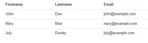
<h2>Basic Table</h2>
<p>The .table class adds basic styling to a table</p>
<table class=”table”>
<thead>
<tr>
<th>Firstname</th>
<th>Lastname</th>
<th>Email</th>
</tr>
</thead>
<tbody>
<tr>
<td>John</td>
<td>Doe</td>
<td>john@example.com</td>
</tr>
<tr>
<td>Mary</td>
<td>Moe</td>
<td>mary@example.com</td>
</tr>
<tr>
<td>July</td>
<td>Dooley</td>
<td>july@example.com</td>
</tr>
</tbody>
</table>
</div>
OUTPUT
Bootstrap Images
Circle:-  Code
<img src="cinqueterre.jpg" class="img-circle" alt="Cinque Terre" width="304" height="236">
Thumbnail
code:-
The .img-thumbnail class shapes the image to a thumbnail:
<img src="cinqueterre.jpg" class="img-thumbnail" alt="Cinque Terre" width="304"
height="236">
Image Gallery
<div class="container">
  <h2>Image Gallery</h2>
  <p>The .thumbnail class can be used to display an image gallery.</p>
  <p>The .caption class adds proper padding and a dark grey color to text inside thumbnails.</p>
  <p>Click on the images to enlarge them.</p>
  <div class="row">
    <div class="col-md-4">
      <div class="thumbnail">
        <a href="/w3images/lights.jpg" target="_blank">
          <img src="/w3images/lights.jpg" alt="Lights" style="width:100%">
          <div class="caption">
            <p>Lorem ipsum donec id elit non mi porta gravida at eget metus.</p>
          </div>
        </a>
      </div>
    </div>
    <div class="col-md-4">
      <div class="thumbnail">
        <a href="/w3images/nature.jpg" target="_blank">
          <img src="/w3images/nature.jpg" alt="Nature" style="width:100%">
          <div class="caption">
            <p>Lorem ipsum donec id elit non mi porta gravida at eget metus.</p>
          </div>
        </a>
      </div>
    </div>
    <div class="col-md-4">
      <div class="thumbnail">
        <a href="/w3images/fjords.jpg" target="_blank">
          <img src="/w3images/fjords.jpg" alt="Fjords" style="width:100%">
          <div class="caption">
            <p>Lorem ipsum donec id elit non mi porta gravida at eget metus.</p>
          </div>
Bootstrap Jumbotron and Page Header
Creating a Jumbotron
A jumbotron indicates a big box for calling extra attention to some special content or information.
A jumbotron is displayed as a grey box with rounded corners. It also enlarges the font sizes of the text inside it.
Tip: Inside a jumbotron you can put nearly any valid HTML, including other Bootstrap elements/classes.
Use a
element with class .jumbotron to create a jumbotron:
Jumbotron Inside Container
Place the jumbotron inside the
if you want the jumbotron to NOT extend to the edge of the screen
Code
<div class="container">
  <div class="jumbotron">
    <h1>Bootstrap Tutorial</h1>
    <p>Bootstrap is the most popular HTML, CSS, and JS framework for developing responsive, mobile-first projects on the web.</p>
  </div>
  <p>This is some text.</p>
  <p>This is another text.</p>
</div>
Jumbotron Outside Container
Place the jumbotron outside the
if you want the jumbotron to extend to the screen edges:
Code
<div class="jumbotron">
<h1>Bootstrap Tutorial</h1>
<p>Bootstrap is the most popular HTML, CSS, and JS framework for developing responsive, mobile-first projects on the web.</p>
</div>
<div>
<div class="container">
  <p>This is some text.</p>
  <p>This is another text.</p>
Creating a Page Header
A page header is like a section divider.
The .page-header class adds a horizontal line under the heading (+ adds some extra space around the element.
Use a <div> element with class .page-header to create a page header:
Example
<div class="container">
  <div class="page-header">
    <h1>Example Page Header</h1>
</div>
<div>
<p>This is some text.</p>
  <p>This is another text.</p>
Bootstrap Wells
The .well class adds a rounded border around an element with a gray background color and some padding:
CODE
<div class="container">
  <h2>Well</h2>
  <div class="well">Basic Well</div>
</div>
Well Size
Change the size of the well by adding the .well-sm class for small wells or .well-lg class for large wells.
CODE
<div class="container">
  <h2>Well Size</h2>
  <div class="well well-sm">Small Well</div>
  <div class="well">Normal Well</div>
  <div class="well well-lg">Large Well</div>
</div>
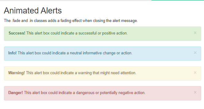
Bootstrap Alerts
Bootstrap provides an easy way to create predefined alert messages
<div class="alert alert-success">
  <strong>Success!</strong> Indicates a successful or positive action.
</div>

<div class="alert alert-info">
  <strong>Info!</strong> Indicates a neutral informative change or action.
</div>

<div class="alert alert-warning">
  <strong>Warning!</strong> Indicates a warning that might need attention.
</div>

<div class="alert alert-danger">
  <strong>Danger!</strong> Indicates a dangerous or potentially negative action.
</div>
Alert Links
Add the alert-link class to any links inside the alert box to create “matching colored links”
Code Explain:-
<div class="alert alert-success">
  <strong>Success!</strong> You should <a href="#" class="alert-link">read this message</a>.
</div>
OUTPUT

Closing Alerts
To close the alert message, add a .alert-dismissible class to the alert container. Then add class="close" and data-dismiss="alert" to a link or a button element (when you click on this the alert box will disappear)
CODE
<div class="alert alert-success alert-dismissible">
<a href="#" class="close" data-dismiss="alert" aria-label="close">×</a>
<strong>Success!</strong> Indicates a successful or positive action.
</div>
Animated Alerts
he .fade and .in classes adds a fading effect when closing the alert message
Code
<div class=”alert alert-danger fade in”>
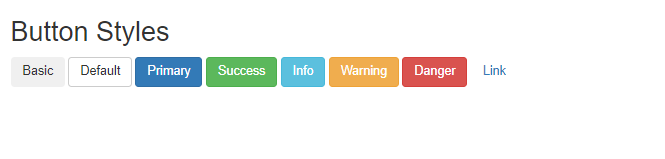
Bootstrap Buttons
Bootstrap provides different styles of buttons
To achieve the button styles above, Bootstrap has the following classes
btnbtn-defaultbtn-primarybtn-successbtn-infobtn-warningbtn-dangerbtn-link
shows the code for the different button styles
Code:-
<button type="button" class="btn">Basic</button>
<button type="button" class="btn btn-default">Default</button>
<button type="button" class="btn btn-primary">Primary</button>
<button type="button" class="btn btn-success">Success</button>
<button type="button" class="btn btn-info">Info</button>
<button type="button" class="btn btn-warning">Warning</button>
<button type="button" class="btn btn-danger">Danger</button>
<button type="button" class="btn btn-link">Link</button>
Output
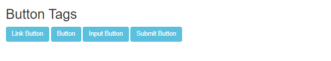
button classes can be used on an <a>, <button>, or <input> element.
Example
<a href="#" class="btn btn-info" role="button">Link Button</a>
<button type="button" class="btn btn-info">Button</button>
<input type="button" class="btn btn-info" value="Input Button">
<input type="submit" class="btn btn-info" value="Submit Button">
Output
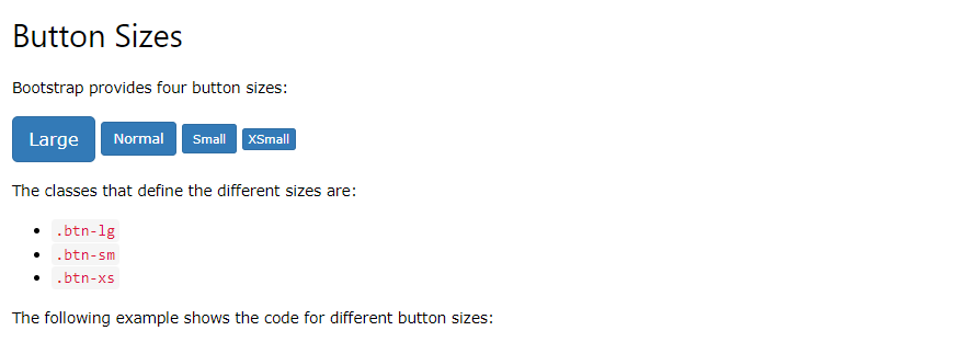
Button Sizes
Bootstrap provides four button sizes
Block Level Buttons
A block level button spans the entire width of the parent element.
Add class .btn-block to create a block level button
Code :-
<button type="button" class="btn btn-primary btn-block">Button 1</button>
Active/Disabled Buttons
A button can be set to an active (appear pressed) or a disabled (unclickable) state
class .active makes a button appear pressed, and the class .disabled makes a button unclickable
Code
<button type=”button” class=”btn btn-primary active”>Active Primary</button>
<button type=”button” class=”btn btn-primary disabled”>Disabled Primary</button>