Creating an attractive website is essential for capturing the attention of visitors and keeping them engaged. An appealing design not only enhances the user experience but also helps in building credibility and trust. Here are some practical tips to make your website design more attractive.
Understand Your Audience

Before diving into design elements, it’s crucial to understand who your target audience is. Knowing their preferences, behaviors, and needs will guide your design choices. Create user personas to visualize your audience and tailor the design accordingly.
In the context of design, it means grasping the preferences, behaviors, and needs of your target audience. This understanding informs decisions about layout, color schemes, typography, and overall user experience. For instance, if you’re designing a website aimed at young adults interested in technology, you might opt for a sleek and modern design with vibrant colors and easy navigation, as opposed to a more traditional layout with muted tones.
Creating user personas is a common technique to visualize your audience segments. These personas represent fictional characters embodying the traits and characteristics of your target audience. By fleshing out these personas with details such as age, occupation, interests, and pain points, you gain insight into what drives them and how to meet their needs effectively.
When it comes to academic assignments, understanding your audience shifts slightly. Here, your audience consists of professors or instructors who will evaluate your work. To excel in this context, you need to comprehend their expectations, academic backgrounds, and perspectives. This understanding enables you to tailor your content to meet their standards and preferences.
For example, if you’re writing a research paper for a sociology professor, you’ll likely need to adopt a more scholarly tone, cite reputable sources extensively, and adhere to specific formatting guidelines. On the other hand, if your assignment is for a creative writing class, you might have more freedom to express your ideas in a more imaginative and personal style.
Simplicity is Key
A clean and uncluttered design is more appealing than a chaotic one. Focus on the essentials:
Minimalist Layout: Use plenty of white space to avoid overwhelming your visitors.
Clear Navigation: Ensure your menu is straightforward and easy to use. Dropdown menus should be logical and not overly complicated.
Simplicity in design is about distilling your message or product down to its core essence and presenting it in a clear and uncluttered manner. When it comes to web design, this principle is crucial for creating an intuitive and enjoyable user experience.
A minimalist layout is one of the hallmarks of simplicity. It involves using ample white space, also known as negative space, to give elements room to breathe. This prevents your website from feeling overcrowded and overwhelming to visitors. By allowing content and visual elements to stand out against a clean backdrop, you draw attention to what’s most important.
Imagine walking into a room that’s cluttered with furniture and knick-knacks strewn about haphazardly. It’s difficult to focus on anything in particular because there’s just too much competing for your attention. Now, contrast that with walking into a room with sleek, modern furnishings and plenty of open space. Your eyes are immediately drawn to the key elements of the room, and you can appreciate them more fully.
Similarly, a website with a minimalist layout allows visitors to focus on the content or products you’re showcasing without distraction. It creates a sense of elegance and sophistication, conveying professionalism and trustworthiness.
Clear navigation is another vital aspect of simplicity in web design. Your menu should be easy to find and use, guiding visitors seamlessly through your site. Dropdown menus, if used, should be intuitive and logical, with categories and subcategories that make sense to your audience.
Think of your website’s navigation as a roadmap for users. If they can’t find what they’re looking for quickly and easily, they’re likely to become frustrated and leave. By prioritizing simplicity in your navigation structure, you enhance the overall user experience and increase the likelihood that visitors will engage with your content or make a purchase.
Consistent Color Scheme
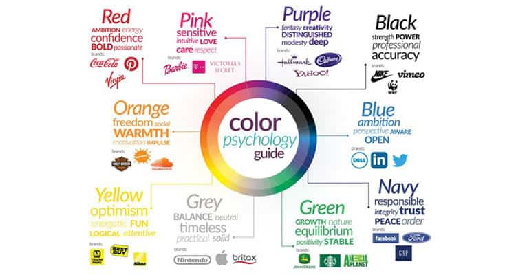
Colors play a significant role in design aesthetics and brand identity:
Color Palette: Choose a color palette that reflects your brand’s personality. Typically, a combination of 2-3 primary colors and a few secondary colors works well.
Contrast: Use contrasting colors for text and backgrounds to enhance readability.
Consistency in color scheme is a fundamental aspect of design that influences both the aesthetic appeal and the recognition of a brand or website. Here’s a deeper dive into why it matters and how to implement it effectively:
Brand Identity: Your chosen color palette is like the visual DNA of your brand. It sets the tone and personality, conveying subtle messages about your brand’s values and identity. For example, a health-focused brand might use calming greens and blues to evoke feelings of tranquility and trust, while a dynamic tech brand might opt for bold, vibrant colors to convey innovation and energy. Consistency in using these colors across all brand materials, from your website to your marketing materials, helps reinforce brand recognition and fosters a sense of familiarity among your audience.
Color Palette Selection: When selecting a color palette, it’s important to consider not only the aesthetic appeal but also the emotional responses and associations that different colors evoke. A well-chosen color palette should resonate with your target audience and align with your brand’s message. Typically, a color palette consists of 2-3 primary colors, which are the dominant hues representing your brand, and a few secondary colors that complement them. These secondary colors can be used for accents, buttons, or other design elements to add visual interest without overwhelming the overall design.
Contrast for Readability: Contrast is essential for ensuring readability and accessibility, particularly when it comes to text and background colors. High contrast between text and background colors makes it easier for users to read and comprehend the content, especially for people with visual impairments. When choosing colors for text and backgrounds, aim for a significant contrast in brightness or hue to maximize readability. For example, black text on a white background or vice versa provides a strong contrast that enhances legibility.
Typography Matters

Fonts can significantly impact the look and feel of your website:
Font Pairing: Use 2-3 complementary fonts for headings, body text, and accents.
Readability: Ensure your text is legible on all devices by choosing appropriate font sizes and weights.
Typography is more than just selecting fonts; it’s about crafting a visual language that communicates your brand’s personality and enhances the overall user experience. Here’s why typography matters and how you can leverage it effectively:
Font Pairing: Just as colors can convey emotion and tone, different fonts carry their own personality and evoke specific feelings. When choosing fonts for your website, consider pairing 2-3 complementary typefaces that create visual harmony while providing contrast and hierarchy. For instance, you might pair a bold, attention-grabbing font for headings with a more neutral, easy-to-read font for body text. This combination helps guide users’ eyes through the content while adding visual interest and reinforcing your brand’s identity.
Readability: No matter how beautiful your typography is, it’s ineffective if users struggle to read the text. Readability is paramount, especially in an era where people access websites on various devices with different screen sizes and resolutions. To ensure legibility across devices, choose appropriate font sizes and weights that maintain readability without sacrificing aesthetic appeal. Aim for a comfortable reading experience, with text that’s neither too small nor too large, and use font weights that provide sufficient contrast against the background. Additionally, consider factors like line spacing (leading) and line length (measure) to optimize readability and prevent eye strain.
Consistency and Branding: Consistency in typography is key to building a cohesive brand identity and reinforcing brand recognition. By using the same fonts consistently across all brand materials, from your website to your marketing collateral, you create a unified brand experience that resonates with your audience. Consistent typography helps establish brand guidelines and fosters trust and credibility among users, who come to associate certain fonts with your brand’s values and personality.
Accessibility: Typography also plays a crucial role in ensuring accessibility for all users, including those with visual impairments. Choose fonts that are easy to read and distinguish, particularly for users with dyslexia or other reading difficulties. Additionally, consider providing options for adjustable font sizes and contrast settings to accommodate diverse user needs.
High-Quality Images and Graphics

Visual content is crucial for creating an attractive design:
Professional Images: Use high-resolution, professional images that are relevant to your content.
Custom Graphics: Consider using custom illustrations and icons to add a unique touch.
High-quality images and graphics are essential components of effective design, as they can captivate audiences, convey messages, and enhance user experiences. Here’s a deeper exploration of why visual content matters and how to leverage it effectively:
Professional Images: The use of high-resolution, professional images can significantly elevate the visual appeal of your design and lend credibility to your brand. These images not only look more polished and aesthetically pleasing but also help establish trust with your audience. Whether you’re showcasing products, services, or brand storytelling, using high-quality imagery that is relevant to your content can create a positive impression and draw users in.
Professional images also contribute to the overall professionalism of your website or design project. Blurry, pixelated, or low-quality images can detract from the user experience and undermine the credibility of your brand. Investing in high-quality photography or sourcing images from reputable stock photo websites ensures that your visual content reflects the quality and professionalism of your brand.
Custom Graphics: While stock photos can be a convenient option, custom illustrations and graphics offer a unique opportunity to differentiate your brand and add a personal touch to your design. Custom graphics allow you to tailor visual elements to align with your brand identity, convey specific messages, and stand out from competitors.
Custom illustrations and icons can also help simplify complex concepts, guide users through processes, and enhance storytelling. Whether it’s through whimsical illustrations, informative infographics, or stylized icons, custom graphics provide an opportunity for creativity and innovation in your design.
Additionally, custom graphics can help create a cohesive visual language across your brand materials, reinforcing brand recognition and identity. Consistency in style, color palette, and imagery can strengthen brand association and leave a lasting impression on your audience.
Responsive Design
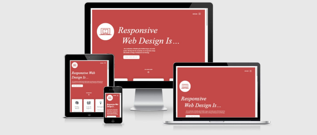
Your website should look good on all devices:
Mobile-Friendly: Ensure your design is responsive and adapts seamlessly to different screen sizes.
Test Across Devices: Regularly test your website on various devices to ensure consistent performance and appearance.
Responsive design is a critical aspect of modern web development, ensuring that your website delivers an optimal user experience across a wide range of devices, from smartphones and tablets to desktop computers. Here’s a more detailed look at why responsive design matters and how to implement it effectively:
- Mobile-Friendly Design: With the increasing use of mobile devices for browsing the internet, it’s essential to prioritize mobile-friendliness in your website design. Responsive design allows your website to adapt dynamically to different screen sizes and orientations, ensuring that users have a seamless experience regardless of the device they’re using. This means that content elements, images, and navigation menus adjust fluidly to fit the screen, eliminating the need for users to pinch, zoom, or scroll excessively.Mobile-friendly design isn’t just about making your website look good on small screens—it’s also about optimizing usability and functionality for touch interactions. This might involve simplifying navigation menus, enlarging clickable elements, and optimizing form inputs for touchscreen keyboards. By prioritizing mobile-friendliness, you can cater to the growing number of users accessing the web on smartphones and tablets and provide them with a positive browsing experience.
- Testing Across Devices: Building a responsive website is only the first step; you also need to regularly test your site across various devices and screen sizes to ensure consistent performance and appearance. This involves using a combination of real devices and browser testing tools to simulate different viewing environments and identify any issues that may arise.Testing across devices allows you to catch potential problems such as layout distortions, navigation issues, or functionality discrepancies before they impact user experience. It also enables you to fine-tune your design and make adjustments as needed to ensure optimal performance across the board.Additionally, keep in mind that responsiveness extends beyond just screen size. Consider factors like network speed, device capabilities, and browser compatibility when testing your website. By prioritizing thorough testing and optimization, you can deliver a seamless and consistent experience to users across all devices and platforms.
Fast Loading Times
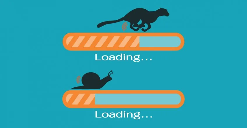
A slow website can deter visitors regardless of its design:
Optimize Images: Compress images without losing quality to reduce load times.
Efficient Code: Minimize CSS and JavaScript files and leverage browser caching.
A slow website can have significant negative impacts on user experience, leading to higher bounce rates, decreased engagement, and ultimately, loss of potential customers or visitors. Here’s a more detailed explanation of why website speed matters and how to optimize it effectively:
User Experience: In today’s fast-paced digital landscape, users expect websites to load quickly and seamlessly. Research has shown that even minor delays in page loading times can result in increased frustration and abandonment rates. Visitors are more likely to leave a website if it takes too long to load, regardless of how well-designed or informative the content may be. Optimizing your website for speed is therefore crucial for retaining visitors and keeping them engaged with your content.
Search Engine Ranking: Website speed is also a significant factor in search engine ranking algorithms. Search engines like Google prioritize fast-loading websites in their search results, as they aim to deliver the best possible user experience to their users. A slow website may be penalized in search rankings, resulting in lower visibility and fewer organic visitors. By optimizing your website for speed, you can improve your chances of ranking higher in search engine results pages (SERPs) and attracting more organic traffic to your site.
Optimizing Images: Images are often one of the main contributors to slow-loading web pages. High-resolution images can significantly increase page load times, especially on mobile devices with slower internet connections. To optimize images for the web, you can use image compression techniques to reduce file sizes without compromising quality. There are various tools and plugins available that automatically compress images upon upload, making it easy to optimize your website’s images without manual intervention.
Efficient Code: Bloated or inefficient code can also slow down your website. This includes CSS (Cascading Style Sheets) and JavaScript files, which control the visual appearance and functionality of your site, respectively. Minimizing and consolidating CSS and JavaScript files can reduce the number of HTTP requests required to load your web pages, resulting in faster load times. Additionally, leveraging browser caching allows browsers to store static resources locally, reducing the need to fetch them from the server on subsequent visits.
Engaging Content

Content should complement your design and keep visitors interested:
Visual Hierarchy: Use headings, subheadings, and bullet points to organize content.
Compelling Copy: Write concise and engaging copy that provides value to your visitors. Visual hierarchy refers to the arrangement and prioritization of content elements on a page to guide users’ attention and understanding. By strategically organizing content using headings, subheadings, bullet points, and other visual cues, you can create a clear and intuitive hierarchy that helps users navigate your website and digest information more easily.
Engaging content is the heart of any successful website or design project. It’s what keeps visitors interested, encourages them to explore further, and ultimately drives them to take action. Here’s a deeper dive into why content matters and how to make it engaging:
Headings and subheadings provide structure and break up long blocks of text, making it easier for users to scan and find the information they’re looking for. Similarly, bullet points and numbered lists can help highlight key points and improve readability. By using a consistent hierarchy throughout your content, you can create a sense of order and coherence that enhances the overall user experience.
Compelling Copy: Beyond just formatting, the quality of your written content plays a crucial role in engaging visitors and keeping them interested in your website. Compelling copywriting involves crafting concise, clear, and persuasive text that resonates with your target audience and provides value to them.
Effective copywriting should focus on addressing the needs, interests, and pain points of your audience while communicating your brand’s message and value proposition. Whether you’re writing product descriptions, blog posts, or marketing copy, strive to be informative, engaging, and authentic. Use storytelling techniques, vivid imagery, and emotional appeal to capture your audience’s attention and create a memorable impression.
Additionally, consider the tone and voice of your brand when writing copy. Are you aiming for a formal, professional tone, or a more casual and conversational style? Tailoring your language and tone to match your brand’s personality helps create consistency and fosters a deeper connection with your audience.
User Feedback and Testing
Finally, always seek feedback and test your design:
User Testing: Conduct usability tests to gather insights from real users.
Feedback Tools: Use tools like surveys and heatmaps to understand user behavior and preferences.
User feedback and testing are integral parts of the design process, helping you identify usability issues, gather insights, and refine your design to better meet the needs of your audience. Here’s a deeper exploration of why user feedback and testing are essential and how to implement them effectively:
User Testing: User testing involves observing real users as they interact with your website or product to identify areas of friction, confusion, or inefficiency. By watching users navigate through tasks, you can uncover usability issues, discover pain points, and gain valuable insights into how to improve the user experience.
There are various methods for conducting user testing, including moderated testing, where a facilitator guides users through tasks and asks questions, and unmoderated testing, where users complete tasks independently while their interactions are recorded. Both approaches provide valuable feedback and can help you identify areas for improvement in your design.
User testing should be conducted at various stages of the design process, from initial prototypes to final products. By involving real users early and often, you can iteratively refine your design based on their feedback, ultimately creating a more intuitive and user-friendly experience.
Feedback Tools: In addition to user testing, feedback tools such as surveys, feedback forms, and heatmaps can provide valuable insights into user behavior and preferences. Surveys allow you to gather quantitative data on user satisfaction, preferences, and demographics, while feedback forms provide a platform for users to share their opinions, suggestions, and concerns directly.
Heatmaps are visual tools that aggregate and display user interactions on a web page, showing where users click, scroll, and move their mouse. By analyzing heatmaps, you can identify patterns, trends, and areas of interest or engagement, helping you prioritize areas for improvement in your design.
Feedback tools can be used in conjunction with user testing or independently to gather insights from a broader audience. They provide valuable qualitative and quantitative data that can inform design decisions and help you better understand your users’ needs and expectations.
Also checkout these:
Android Studio Error: “FAILURE: Build failed with an exception”
How to Make Your Website Trending on Google Search
How to build Android apk or App Bundle
Resolving the “laravel/ui Package” Error in Laravel Authentication
Intel HAXM Installation Failed in Android Studio Emulator
Essential Flutter Packages for Efficient App Development
How to use image_picker in Flutter
Flutter: Resolving the “Plugin Not Found” Error in Android Gradle Builds